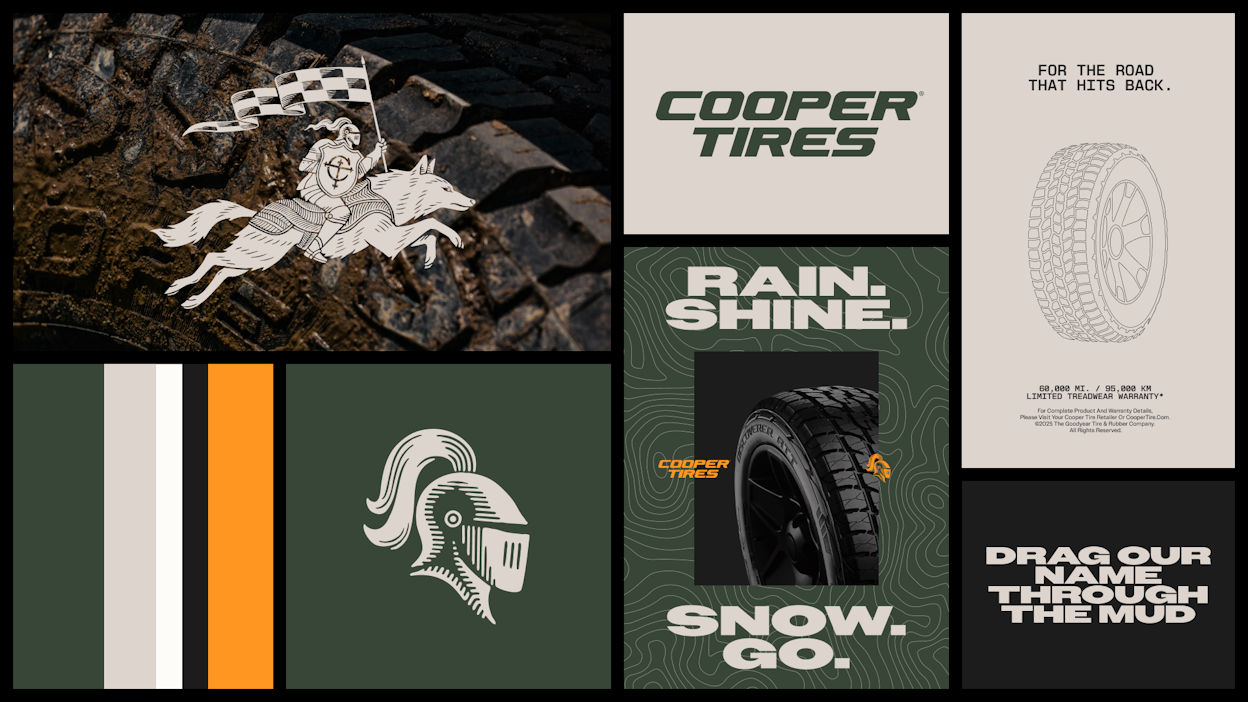
Cooper Tires literally invites drivers to drag its name through the mud. But don’t worry, this is part of a new image overhaul that also includes updates to the brand logo, a refined colour palette, and a more contemporary design language – all with the aim of helping the brand cut through in crowded retail environments and digital marketplaces. Consumers will begin seeing the new branding from March 2026 on Cooper website updates across the globe, Cooper social channels updating identity and content, and in paid media activity launching in selected markets. Retail points of sale will transition over time.
“Cooper Tires has unveiled a bold new global brand look and feel designed to elevate its visibility, strengthen consumer recognition, and solidify its standing in an increasingly competitive global market, all while resonating with drivers who count on dependable tyres to get the job done,” states brand owner The Goodyear Tire & Rubber Company. “For over 100 years, Cooper has earned the trust of drivers who demand more from their tyres – and themselves. This heritage runs through the new identity, which pairs Cooper’s proven DNA with a modern aesthetic. The result is a look that signals strength, purpose, and confidence.”
Legendary icons
The rethinking of the brand includes the logo, and here the talk is of “returning to the icons that made Cooper legendary.” Goodyear provides a brief history of the marque to explain: In the 1940’s the Armored Cord tyre made Cooper’s name in the industry, inspiring the Cooper team to incorporate a knight’s helm into the brand logo. The brand refresh pays tribute to this iconic symbol; “reborn, sharpened and ready to lead the brand into its next era.”
Joining the knight is a new figure central to the brand’s story: the American grey wolf. “Fierce, adaptable, and always prepared for the terrain ahead, the wolf mirrors the spirit of Cooper drivers and the capability of Cooper products.” Native to Cooper’s home state of Ohio, the wolf “embodies determination, wittiness and ruggedness.” Both the knight and wolf will be visible across brand assets and hero brand moments.
New Cooper palette
A new colour scheme accompanies the refreshed design. These colours are “rooted in history and built for visibility.” Valor Green draws from Cooper’s long heritage of designing products built for demanding conditions and the natural landscapes where they’re used. “It represents durability, expertise, and a connection to the outdoors,” elaborates Goodyear. “It’s a modern expression of the environments Cooper tyres are made to tackle – a reminder that the brand helps drivers go farther, explore more, and trust the ground beneath them.”
A heritage orange accent colour originates from the early days of the Cooper brand, signalling “energy and unmistakable character.” The palette also leans into nature which, as Goodyear comments, “is at the heart of the Cooper brand.” Consumers will also note changes in typography, photography and illustration in the new brand identity.
Trusted quality tyre brand
“This new identity reflects what Cooper Tires stands for today – a trusted, quality tyre brand with a strong global footprint,” says Jan-Piet van Kesteren, Managing Director EMEA & Chief Sales Officer EMEA Consumer. “As part of the Goodyear family, Cooper is better positioned than ever to serve drivers with products that deliver durable performance, and our refreshed brand system helps communicate that story more clearly and consistently.
“We’ve kept what people value about Cooper, no-nonsense performance and character, and made it even easier to spot in a crowded market. This identity isn’t decoration; it’s a working tool for our drivers, dealers and partners.”
Goodyear created the refresh in collaboration with Publicis P1T Crew, creatively led by BBH USA.
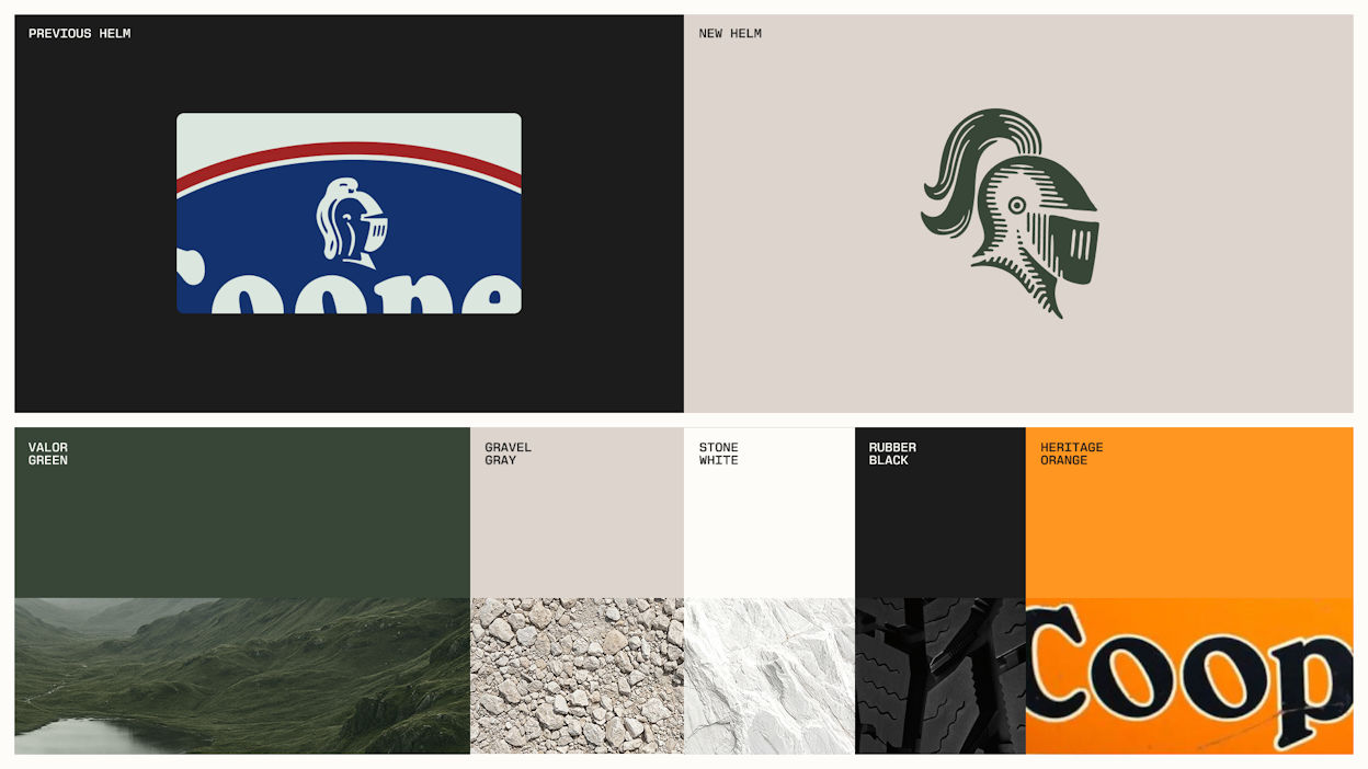
The US flag colours are gone, replaced by Valor Green, Heritage Orange, Gravel Grey, Stone White and Rubber Black (Image: Goodyear)